Thursday 1 March 2012

Main Task - Three Final Music Magazine Designs

These are my three final music magazine designs. They were uploaded via a JPEG file. They show what my front cover, contents page and double page spread look like at the end...


Thursday 9 February 2012

Main Task - Media Studies PowerPoint

This is my media studies evaluation I made using Microsoft PowerPoint. This evaluation consists of over 30 slides, telling you how I have made changes from my first magazine to my music magazine I produced. I had to think about what type of soft and hardware I used, how I could improve my latest product from my previous one, and how I could market my product within the music industry...

Wednesday 8 February 2012

Preliminary Task - Final Production Of Priestley College Front Cover


This is my final piece for my Priestley College Magazine.

Preliminary Task - Final Production Of Priestley College Magazine Contents Page

This is my final piece for my contents page.

Preliminary Task - AS Media Studies Evaluation

 AS Media Studies Evaluation
 The first thing I did for this college magazine was planning out what I could do for my front cover; it took lots of time to work out how I wanted it to look. I had a look on other magazines to get a rough idea of how I wanted it to look like; they included lots of thing, from titles and pictures, to pricing and cover lines. Eventually, I had completed my front cover, and moved on to my contents page.
In order to produce my college front cover and contents page, I had to use Adobe Photoshop. For me, this was rather difficult as I have never used the software before. I use lots of different tools to ensure that I produced my magazine properly, such as tools which were able to cut unwanted parts, changing backgrounds, changing texts by using strokes etc.
                        
The box above shows the rectangular marquee tool. This tool is used to cut unwanted images or text. However, I cannot do this correctly without selecting inverse. This allows me to keep the part I want and get rid of the unwanted sections. For example, the dotted lines which are surrounding the piece of text are the part which I want to keep, whilst the dotted lines surrounding the outline of the page is the bit I want to get rid of. By pressing the delete button, the text should be the only thing which hasn’t been deleted.
Now, because I have got the text which I want, I could place it onto my contents of front cover. I could place it behind an image, or in front. In order to do this, I have to find the layer with the title    “Priestley College” and drag it under or over any layer.  By using the magic wand tool, I can get rid of any unwanted bits of the text. I.e. the background in the text doesn’t match the building wall.
 The image above indicates the magic wand tool; notice how the background of the text doesn’t match the wall. By pressing delete, the white will disappear.


Now the white text has disappeared, I can get rid of the rest of the white within the holes of the text by doing the same thing again.

If I were to do this assignment brief again, I would ensure that I spend more time on the contents page and the front cover. It means that I don’t have to rush and mess things up. For example, I spent more time on my front cover than my contents page. Now one looks much better than the other. I would change my entire contents page, as I feel that I haven’t done enough work on it for it to be finished. If I had more time, I would make it look what I wanted it to look like.

Preliminary Task - Final images for college magazine.

This post will relate a lot to other posts, where I have took certain screen grabs to show how I have manipulated certain texts and images.


This is one of the images I am going to use for my contents page as it shows a small part of the subjects people can take at the college. This course is named "The International Baccalaureate". This is where students can take six different subjects from six sections. For example,  they can choose, English Lit.,  French, Maths, Film Studies, Biology and History.

I think that choosing this was a great feature in my college magazine, because Priestley College always make sure that they promote this course.  I didn't need to edit this photo in any way, as I had already took the photo really close up. However, the only thing I needed to do was to rotate the shot of this image, as the image was on its side.


This image is used in ym contents page also because it refers to one of the main parts of the magazine, which is the achievements made by the students withint the college. I think that this was an important feature to put in my magazine, because it represents the high standards this college has. 

Having a map in the magazine is always an important thing.This will be used to ensure that newer students will know where they are going.I didn't have to edit any part of this image, because I took the photo and the photo's above from a extreme close up shot.

Tuesday 7 February 2012

Preliminary Task - Production of magazine front cover

In this post, I will be able to show you some examples of where I had to use the tools provided on Adobe Photoshop in order to manipulate certain things. These things could be:

- Images
- Titles
- Shapes
This is an example used for my title of my magazine, ' Life @ Priestley'. What I have done here is I have simply found a website ( dafont.com ) and screen grabbed the text I want onto photoshop. The next step I'm about to do is to use the rectangular marquee tool. This enables me to cut anything I want and delete any unwanted sections. The next step is to select the inverse button. This enables me to keep the text I want, and to get rid of any unwanted sections.


Now, because I have got the text which I want, I could place it onto my contents of front cover. I could place it behind an image, or in front. In order to do this, I have to find the layer with the title “Priestley College” and drag it under or over any layer. In this case, the text will be in front of a blue background. By using the magic wand tool, I can get rid of any unwanted bits of the text. I.e. the background in the text doesn’t match the blue background.

The circle above indicates the magic wand tool; notice how the background of the text doesn’t match the blue background.By pressing delete, the white will disappear. 

Now the white text has disappeared, I can get rid of the rest of the white within the holes of the text by doing the same thing again.

Now, for my background, I have decided to use one of the Priestley students. I have chosen to do this as it signifies that the magazine can relate to the students at the college by using images of current students.
This is my background for my front cover. In order to get this photo onto photoshop to manipulate, I had to drag the image from my work files onto the page. I would then have to drag the layer down to the bottom. This enables for any other layer to stay on top of the background. Without this, any text or image would be behind the background, which would mean that all you could see is the background and not the text.


Okay, so this is my final background for my college magazine. It's a medium / close up shot from a current student at the college. what makes it appealing to look at is that he has a smile on his face. This shows the audience that the college is a place where people enjoy learning.


This is my final piece for my front cover magazine. It contains a lot of eye cathing text and big fonts. I decided to keep the name of my magazine the same, because I didnt want to change anything for my magazine. If i came up with something, I would more or less keep it!

Note how the title is in front of the student's head. This is what I was mentioning about earlier on layers. The background would be the bottom layer. This enables all the rest of the text and images to be shown on top of the bottom layer.


Preliminary Task - Final Images For Front Cover.

Final images for college magazine

I think that I chose this image in my contents page because, the newer students can get a feel of where they are and where they need to go. Being lost in a new place isnt always the best idea, but the fact that a map is included helps the students know where they're going. I didnt change the image in any way when i was sorting out what my contents page would look like, therefore, the image will remain the same.
I decided to use this image of the sporting achievements in my college magazine because i think that it is important to always show the previous achievements past and present students have done, which have influennced the students to perform. For example, there could be a frame of a professional basketball player on the wall, and all the other basketball players in the college would look up to that person, so that maybe one day they could be up there. The only thing I think I did to this image was to rotate the image, but im not sure.
It's alway important to show at least some of the subjects which people are eligable to take because toherwise, people wouldnt know what subjects you can or can't take. I think that when I was producing my magazine, I think that I would of rotated the image above so that people are able to properly see what the image is. Also, I would of shrunk the image, so that it would fit on the page properly.
This picture is in my contents page so thay students can se that we have an eating area. This enables students who dont want to go outside of the college to eat, to have a place where they can eat. This is also used as a popular social area, as the cafe contains sofa's and televisions everywhere!

I have decided to use this image of this person for my front cover background for my college magazine. I had to think of an image, where it could relate to the college. For example, if a college magazine has a dog on the front cover, then it wouldnt relate to the magazine, where as if i had a college student on the front cover, it would make sense. In terms of manipulating the image of the student, there isnt really anything i am going to change about him. I would place cover lines around him, but not to many as it would wreck the main feature's image (student).

Monday 6 February 2012

Preliminary Task - Photographs for college magazine.

I have taken a few shots of the college using one of the college's cameras. These images are the main images which I will be likely to use for my contents page.


Sunday 5 February 2012

Preliminary Task - Planning Content

Life @ Priestley contents ideas
               List of regular content which will appear in magazine
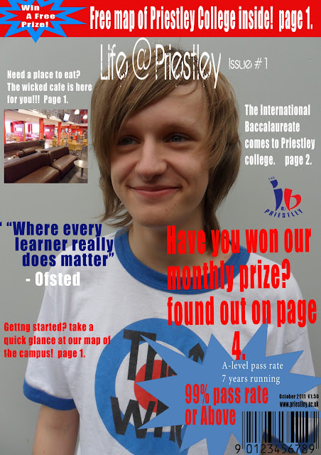
®     Introductory welcome paragraph about Priestley College. (Photos of college, map of college, main people in college i.e. headmaster).
®     Achievements at Priestley. (99% pass rate 7 years running etc).
®     Getting started at Priestley College. (Image of books or a test).
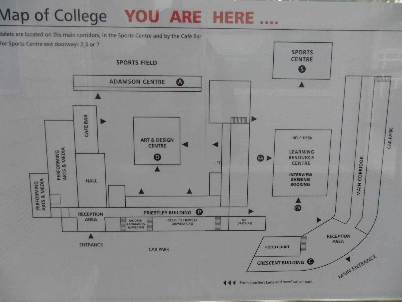
®     Map of the campus.
®     Enrichment programmes and subjects here at Priestley College.
®     Eating areas (Wicked café).
®     Smoking areas.
®     School teams & clubs (student in Priestley gear outside sports centre).
®     Need money fast?   (Bank/ cash machine image from the cash office).
®     Student service.

10 featured articles which will appear in magazine

-          Get fit with Priestley’s sports facilities
-          Journey to other places with languages
-          Trips with enrichment courses
-          Get exotic with dance and art
-          Rocking with music
-          Sporting achievements
-          Academic achievements
-          Become technical with media and film studies
-          Extra’s & events
-          Student experiences

Images for contents page

There are some images which I will need to include in my contents page. This ensures that the contents page becomes as appealing as the front cover. These are some of the ideas I came up with for my contents page:

-          Logo of Priestley College.
-          Image of sports hall.
-          A shot of the map of the campus.
-          An image of the sporting achievements here at Priestley college.
-          Image of the LRC.
-          And finally, I wanted to get an image of the entrance of the college.

When choosing which images to use, I may slightly alter which images I should use, meaning that some of the above may or may not be used.

Preliminary Task - Rough Layout Of Contents Page.

I have come up with a few suggestions for the planning of my contents page. It consists of regular content such as the title, features, images, dates etc. I had to think about the layout design for my contents page. I had to think how it could look appealing, and what I could put  in my magazine.

Saturday 4 February 2012

Preliminary Task - Rough Layout Of Front Cover

I have produced a rough idea of what my front cover is going to look like.  It includes the basic things needed for every magazine front cover; title,images,masthead,barcode,issue dates, price,coverlines etc.
The image above is the rough layout for my front cover. Most of the content i have used will be used, such as the title, cover lines, and the bottom right part of the page. However, if needed, I might have to change the background, it depends on what I think will be better.

Preliminary Task - Plans For Front Cover

I have uploaded the plans of the front cover using Microsoft word. They include title ideas, details of mise-en-scene for front cover images, and also the cover lines for the front cover.

Plans for front cover
Title

These are some ideas for the title I came up with for my college magazine:

-      Life at Priestley
-      Priestley times
-      Priestley college
-      Fresh start
-      College survival
-      The college magazine

The title I have decided to use in my college magazine will be “Life at Priestley”.

Details of mis-en-scene images for front cover

These are some rough ideas which will be possibly added for the front cover:

-      Priestley college front entrance as background. This is used as this relates to what the magazine is about. For example, a kerrang magazine would have famous song artists as they relate to what the magazine is about.

-       Lively People (students, staff etc), in background. This shows that there is a lively atmosphere, meaning that people want to be here.

-      Sunny background, lively, bright colours. These factors help promote the magazines as the colour schemes. They show that the place i.e. Priestley college is a happy, bright, lively place. It’s a place where people want to learn and have fun.

-      Use of facilities such as student car parking and bike shelters. These help promote the students who are able to travel by using their own transportation. 

Cover lines for front cover

These are some rough ideas for any cover lines to be used on the magazine front cover.


-      Priestley’s upcoming events
-      Amazing trips with the language department
-      We’re here to help with student services
-      Too much spare time? Enrichment courses are here for you!


Monday 30 January 2012

Main Task - Music Magazine Double Page Spread Article Design

This is my design diary for my double page spread article, featuring " Jake Rhymes". Like the other design diaries, this showsw the different stages I got up to in lesson time. Instead of having one page, I had to make an A3 page, so that I could have one page as the main image, and the other page for the article and tour dates...


Friday 27 January 2012

Main Task - Music Magazine Contents Page Design

This is my design time line for my contents page. It includes the different steps I made for my contents page.


Main Task - Music magazine front cover design

This is my timeline which consists of all the different changes I made for my music magazine. The first couple of pictures are the first parts I created for my front cover, where as the later images show what the final result will look like.


Sunday 1 January 2012

Main Task - Video Responses

This is the first video response I got when I asked somebody about what type of music they like:


On the second video response I recorded, for some strange reason, it didn't record the sound, and I have no idea why. In this video, I shall use a type out, so that it is easy to understand what was said in the video. The questions from my questionnaire are the bits within the video below which I asked Max, however the blue text indicates extra parts I added in.. The text colored in red are the bits where I got Max to answer. The text in black


Questionnaire

1)      What type of music genre do you like? 
               Hip Hop.


2)      How often do you buy a music magazine? 

Once a week         Once a month     More than twice a week       More than twice a month                   Never.
                          
3)      What are your favourite types of bands/ who are your favourite artists?

               Erm, Lil' Wayne, Rick Ross.


4)      Why do you buy music magazine? ( Well we know you don't do you)


         No. I don't buy them.


5)      How much money would you spend on a music magazine? 


         I don't know. Two pounds?


6)      What do you think makes a great music magazine? 


         Dont know. 
         
7)   Do you like having incentives such as free gifts in magazines? If yes or no, please say why?


      Yes I do.


8)   What do you like to see in a magazine? (Do you like the articles, the layout, role models?)


       Yeah I do.


9)      How long has it been since you have last bought a music magazine?
              
   I haven't. 


10)   Do you prefer the newer music magazines, or the older magazine companies the most and why?

Newer, more up to date. More sophisticated.