Thursday 1 March 2012

Main Task - Three Final Music Magazine Designs

These are my three final music magazine designs. They were uploaded via a JPEG file. They show what my front cover, contents page and double page spread look like at the end...


Thursday 9 February 2012

Main Task - Media Studies PowerPoint

This is my media studies evaluation I made using Microsoft PowerPoint. This evaluation consists of over 30 slides, telling you how I have made changes from my first magazine to my music magazine I produced. I had to think about what type of soft and hardware I used, how I could improve my latest product from my previous one, and how I could market my product within the music industry...

Wednesday 8 February 2012

Preliminary Task - Final Production Of Priestley College Front Cover


This is my final piece for my Priestley College Magazine.

Preliminary Task - Final Production Of Priestley College Magazine Contents Page

This is my final piece for my contents page.

Preliminary Task - AS Media Studies Evaluation

 AS Media Studies Evaluation
 The first thing I did for this college magazine was planning out what I could do for my front cover; it took lots of time to work out how I wanted it to look. I had a look on other magazines to get a rough idea of how I wanted it to look like; they included lots of thing, from titles and pictures, to pricing and cover lines. Eventually, I had completed my front cover, and moved on to my contents page.
In order to produce my college front cover and contents page, I had to use Adobe Photoshop. For me, this was rather difficult as I have never used the software before. I use lots of different tools to ensure that I produced my magazine properly, such as tools which were able to cut unwanted parts, changing backgrounds, changing texts by using strokes etc.
                        
The box above shows the rectangular marquee tool. This tool is used to cut unwanted images or text. However, I cannot do this correctly without selecting inverse. This allows me to keep the part I want and get rid of the unwanted sections. For example, the dotted lines which are surrounding the piece of text are the part which I want to keep, whilst the dotted lines surrounding the outline of the page is the bit I want to get rid of. By pressing the delete button, the text should be the only thing which hasn’t been deleted.
Now, because I have got the text which I want, I could place it onto my contents of front cover. I could place it behind an image, or in front. In order to do this, I have to find the layer with the title    “Priestley College” and drag it under or over any layer.  By using the magic wand tool, I can get rid of any unwanted bits of the text. I.e. the background in the text doesn’t match the building wall.
 The image above indicates the magic wand tool; notice how the background of the text doesn’t match the wall. By pressing delete, the white will disappear.


Now the white text has disappeared, I can get rid of the rest of the white within the holes of the text by doing the same thing again.

If I were to do this assignment brief again, I would ensure that I spend more time on the contents page and the front cover. It means that I don’t have to rush and mess things up. For example, I spent more time on my front cover than my contents page. Now one looks much better than the other. I would change my entire contents page, as I feel that I haven’t done enough work on it for it to be finished. If I had more time, I would make it look what I wanted it to look like.

Preliminary Task - Final images for college magazine.

This post will relate a lot to other posts, where I have took certain screen grabs to show how I have manipulated certain texts and images.


This is one of the images I am going to use for my contents page as it shows a small part of the subjects people can take at the college. This course is named "The International Baccalaureate". This is where students can take six different subjects from six sections. For example,  they can choose, English Lit.,  French, Maths, Film Studies, Biology and History.

I think that choosing this was a great feature in my college magazine, because Priestley College always make sure that they promote this course.  I didn't need to edit this photo in any way, as I had already took the photo really close up. However, the only thing I needed to do was to rotate the shot of this image, as the image was on its side.


This image is used in ym contents page also because it refers to one of the main parts of the magazine, which is the achievements made by the students withint the college. I think that this was an important feature to put in my magazine, because it represents the high standards this college has. 

Having a map in the magazine is always an important thing.This will be used to ensure that newer students will know where they are going.I didn't have to edit any part of this image, because I took the photo and the photo's above from a extreme close up shot.

Tuesday 7 February 2012

Preliminary Task - Production of magazine front cover

In this post, I will be able to show you some examples of where I had to use the tools provided on Adobe Photoshop in order to manipulate certain things. These things could be:

- Images
- Titles
- Shapes
This is an example used for my title of my magazine, ' Life @ Priestley'. What I have done here is I have simply found a website ( dafont.com ) and screen grabbed the text I want onto photoshop. The next step I'm about to do is to use the rectangular marquee tool. This enables me to cut anything I want and delete any unwanted sections. The next step is to select the inverse button. This enables me to keep the text I want, and to get rid of any unwanted sections.


Now, because I have got the text which I want, I could place it onto my contents of front cover. I could place it behind an image, or in front. In order to do this, I have to find the layer with the title “Priestley College” and drag it under or over any layer. In this case, the text will be in front of a blue background. By using the magic wand tool, I can get rid of any unwanted bits of the text. I.e. the background in the text doesn’t match the blue background.

The circle above indicates the magic wand tool; notice how the background of the text doesn’t match the blue background.By pressing delete, the white will disappear. 

Now the white text has disappeared, I can get rid of the rest of the white within the holes of the text by doing the same thing again.

Now, for my background, I have decided to use one of the Priestley students. I have chosen to do this as it signifies that the magazine can relate to the students at the college by using images of current students.
This is my background for my front cover. In order to get this photo onto photoshop to manipulate, I had to drag the image from my work files onto the page. I would then have to drag the layer down to the bottom. This enables for any other layer to stay on top of the background. Without this, any text or image would be behind the background, which would mean that all you could see is the background and not the text.


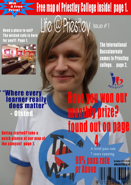
Okay, so this is my final background for my college magazine. It's a medium / close up shot from a current student at the college. what makes it appealing to look at is that he has a smile on his face. This shows the audience that the college is a place where people enjoy learning.


This is my final piece for my front cover magazine. It contains a lot of eye cathing text and big fonts. I decided to keep the name of my magazine the same, because I didnt want to change anything for my magazine. If i came up with something, I would more or less keep it!

Note how the title is in front of the student's head. This is what I was mentioning about earlier on layers. The background would be the bottom layer. This enables all the rest of the text and images to be shown on top of the bottom layer.